Tuesday, 21 August 2012
Monday, 20 August 2012
Sunday, 19 August 2012
Thursday, 16 August 2012
Wednesday, 15 August 2012
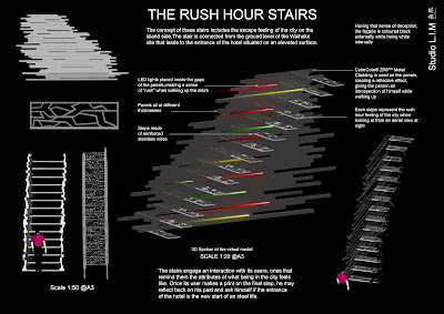
Rush Hour Stairs
I created this section after the hand-in of our CNC files (which worked, thank goodness!) The horizontal elements are meant to appear like rushing lines of motion, as if the entire stair is moving. This is enhanced by horizontal hollows on the insides of the walls which have LED lights set into them, so that they appear as rushing lines of traffic.
Group 14 review
Group 14 consisted of the making of two different stairs, one that would blend in with the theme of a utopian city and the other dystopia. The use of fractal architecture was clearly expressed on the dystopian staircase, where a curve figure formed a statistical character creating a whole. The use of repeated self-similar patterns shaped an interesting organic form that appeared to be nearly the same looking from different scales. This idea perhaps helped creating an audacious significant landmark to the setting of the structure. From the novel, the stairs are supposed to create a sense of ‘happiness’ based from what we ought to call what an ‘ultimate city’ is.
The second staircase consists of a utopian technological theme, where raw mechanics are being applied in order for it to function in a sophisticated manner. Raw materials like iron are being integrated into the structure which creates a sense of natural framework that fits with the ideal of what we would define a utopian city to be.
The second staircase consists of a utopian technological theme, where raw mechanics are being applied in order for it to function in a sophisticated manner. Raw materials like iron are being integrated into the structure which creates a sense of natural framework that fits with the ideal of what we would define a utopian city to be.
Thursday, 9 August 2012
Wednesday, 8 August 2012
Atmospherical models
Claustrophobia.
Deception and illusion. From one side it appears like a whole, solid cube, but from the other we can see that it is in fact empty.
Claustrophobia. Lots of pins stuck in at different angles gives a crowded, intimidating appearance.
Atmospheres
Claustrophobia sense of city.
Feeling of being trapped inside that continuous sense of dystopian architecture.
Green space involved. Wall separating the two parallel entity.
Feeling of having the grass 'greener' on the other side
Team 13 peer review
The section produced by team 13 uses an interesting effect of blurriness within the building emphasizing on the abandoned presence of dystopia. Standing out from the picture is a series of parked cars aligned next to the apartment building that reflects on the revival of the city in which we can relate to the story.
Different materials are expressed on the façade of the building, bringing out a contrast of ‘natural’ and ‘artificial’ theme that represents the dissimilarity between the two environmental aspect of cityscape and suburban. The imperfection on the façade (scratches, cuts) highlights on the aspect that a utopian environment can only be appreciated once we look through what we would consider to be imperfect. The combination of wood and concrete attracts the attention of two opposite media in which brings a connection between the two atmospheric changes (utopia, dystopia)
Subscribe to:
Comments (Atom)


